已加利福尼亚房价数据集为例子,但是加载时候无法加载,因此直接下载到本地,点击下载。在本地为两个文件:
1、加载包
%matplotlib inline
%config InlineBackend.figure_format = 'svg'
import shap
import xgboost as xgb
import numpy as np
import pandas as pd
import matplotlib.pyplot as plt
from sklearn.datasets import fetch_california_housing
from sklearn.model_selection import train_test_split
from sklearn.metrics import mean_squared_error
plt.rcParams['font.sans-serif'] = ['SimHei']
plt.rcParams['axes.unicode_minus']= False #解决负数无法显示
pd.set_option('display.max_columns',None)
pd.set_option('display.max_rows',None)
2、加载数据
domain_path = "/Users/xujun/Downloads/CaliforniaHousing/cal_housing.domain"
column_names = []

with open(domain_path, 'r') as file:
    for line in file:
        # 提取冒号之前的部分作为列名,并去掉多余空格
        column_name = line.split(":")[0].strip()
        column_names.append(column_name)

print("列名:", column_names)
# 数据文件路径
data_path = "/Users/xujun/Downloads/CaliforniaHousing/cal_housing.data"

data = pd.read_csv(data_path, header=None, names=column_names, sep=",")
# 分离特征和目标变量
X = data.iloc[:, :-1]  # 特征(保留为 Pandas DataFrame)
y = data.iloc[:, -1]
3、划分训练集和测试集,并训练 XGBoost 模型
# 2. 划分训练集和测试集
X_train, X_test, y_train, y_test = train_test_split(X, y, test_size=0.2, random_state=42)

# 3. 训练 XGBoost 模型
model = xgb.XGBRegressor(objective="reg:squarederror", n_estimators=100, max_depth=4, random_state=42)
model.fit(X_train, y_train)
4、接下来,计算 SHAP 值,并展示所有特征对预测的整体影响。
shap.initjs()
explainer = shap.Explainer(model, X_train)
shap_values = explainer(X_test)
# 使用 feature_names 参数指定特征名称
shap.summary_plot(shap_values, X_test, feature_names=X.columns.tolist())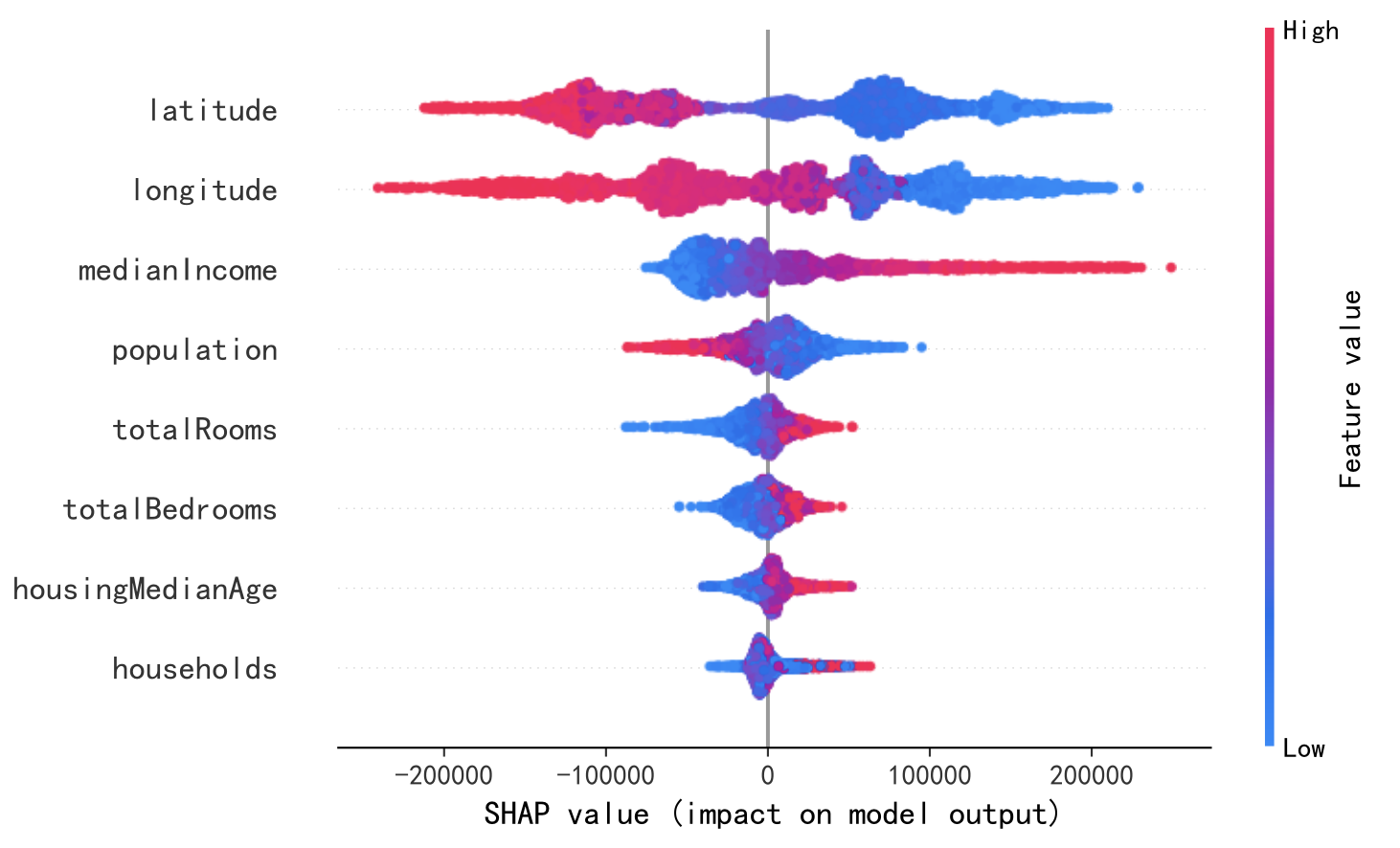
5、接下来,使用 force_plot 图,直观展示单个样本的预测分解。
shap.force_plot(explainer.expected_value, shap_values[1].values, X_test.iloc[1], matplotlib=True)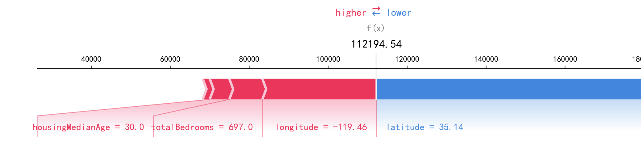
6、使用 Dependence Plot(依赖图) 显示特征 population如何影响预测,同时考虑与其他特征的交互效应。
shap.dependence_plot("population", shap_values.values, X_test)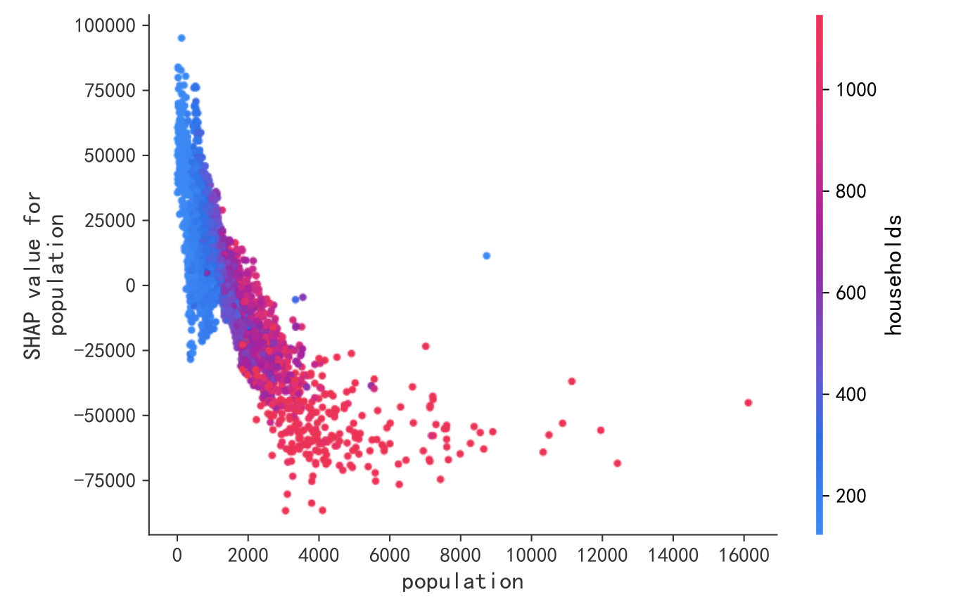
7、使用 Decision Plot(决策图) 展示特征在决策路径中的累积影响。
shap.decision_plot(explainer.expected_value, shap_values.values[:1], X_test.iloc[:1])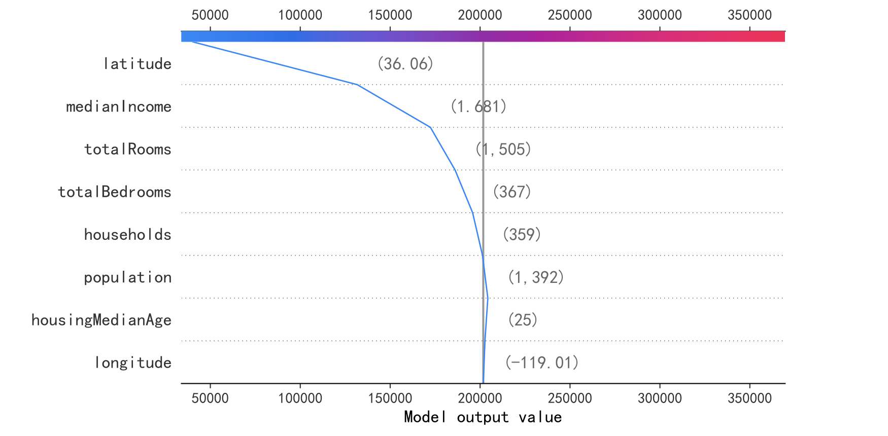
原创文章(本站视频密码:66668888),作者:xujunzju,如若转载,请注明出处:https://zyicu.cn/?p=19904
 微信扫一扫
微信扫一扫  支付宝扫一扫